Tories branch out with new logo
The Conservatives have unveiled their new party logo, prompting a flurry of discussion among Tory supporters.
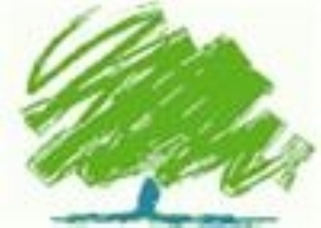
The blue and green scribbled tree – designed at a cost of £40,000 – will replace the flaming torch which has represented the Tories since 1977.
Although it received a revamp under Michael Howard two years ago, new leader David Cameron decided a more modern logo was needed to reflect a changed party.
“We consulted membership across the country about our new visual identity. The values [they] wanted to see represented were strength, endurance, renewal and growth,” a Conservative spokesman said.


“We tested a large number of different images and the tree logo proved the overwhelming favourite.”
However, the reaction among party activists has not been so favourable and on the Conservative Home website, which first unveiled the logo ahead of its official launch at next month’s party conference, bloggers have let rip.
“It’s just a scribble, not built to last, to coin a phrase,” said cllr Paul Johnston.
Nicholas Bennett added: “Good to see my members’ subs being spent on high profile political campaigning, but why did they steal my two year old niece’s picture?”
Another dismissed it as a “magic mushroom”, although one contributor noted: “As anything is better than the Stalinist torch – I’ll learn to love it.”
Cllr Lee Chamberlain added: “It’s growing on me, no pun intended.”
The new-look logo will be the backdrop to the party conference in October, where Mr Cameron has also arranged a series of events to liven up proceedings – including a daily grilling for would-be Tory MPs by Ann Widdecombe.
But the Labour party was scathing, with a spokesman saying: “This is classic David Cameron – putting his public relations strategy ahead of tough policy decisions. The Conservative party needs more than a respray if it’s going to be taken seriously.”

