Lib Dems ‘have best party logo’
By Phil ScullionFollow @PhilScullion
The Liberal Democrats may be behind Labour and the Conservatives in the polls, but that is not down to their logo say marketing experts.
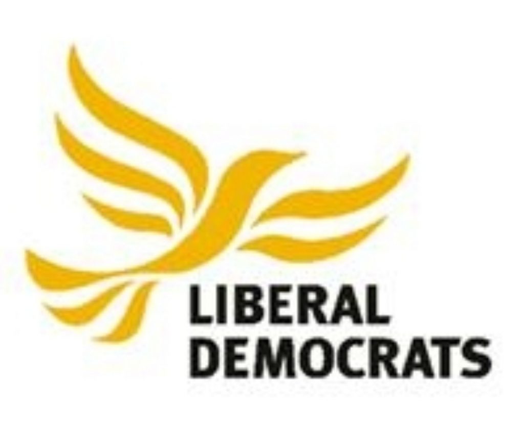
A poll of branding experts carried out by EMR declared Nick Clegg's party, currently gathered for the Liberal Democrat conference in Birmingham, to have by far the best logo of the three main parties.
Use of the liberty bird was praised as easily recognisable and appropriate branding linked to a guiding Liberal Democrat principle – freedom.


The 'scribbled tree' adopted by the Conservative party came in second and Labour's traditional red rose was last.
Simon Bassett, managing director of EMR, emphasised the importance of logos as a "focal point" for party identity.
He highlighted the performance of the 'scribbled tree', which ex-Conservative party chairman Norman Tebbit once referred to as "a bunch of broccoli", as particularly disappointing seeing as it cost the party £40,000 in design fees five years ago.
"It might have been created in an effort to represent the party's 'strength, endurance, renewal, and growth' but the marketing professionals we spoke to felt that the scribbled way the tree was drawn had to change," he added.
Marketing experts recommended that the oak tree should be maintained, but redrawn to look more like a tree, but with less emphasis on the colour green to prevent confusion between the Conservative and Green parties.
EMR redesign of the Conservative party logo:

The Labour party's red rose was considered the worst logo, eliciting criticism for its stark colour scheme.
Mr Bassett said: "Despite being the brainchild of marketing maestro Peter Mandelson, the current version of the red rose was rejected wholeheartedly by the marketing community."
However the marketing experts recommended that the rose concept should be retained by Labour but perhaps in the form of a Tudor rose or rose with a stem. They also suggested a different typeface could help create a more modern and distinctive image.
EMR redesign of the Labour party logo:

Whilst the Liberal Democrat logo was the most popular some ideas were still offered to improve it, notably shortening the name on the logo to "The Liberals" and making the bird on the logo smaller to add prominence to the party name.
EMR redesign of the Liberal Democrat logo:

"Clearly the political future of the country's three largest parties will be set by the public's reaction to their policies, their leaders, and their ability to communicate their brand promise. But logos are important too," Mr Bassett added.
The research comes at a time of much debate over political branding, with suggestions that the Conservative party needs to go through a total re-brand in Scotland if it is ever to regain a significant presence north of the border.

